All-In Health and Wellness
My Roles: User Experience Designer, UX Researcher
Duration: 3 weeks
Tools: Figma, Sketching, Zoom, Google Sheets, Keynote
The Challenge
I wanted to research and design the concept for a new Health & Wellness app that would assist users in managing, improving, and monitoring their overall health— both physically and mentally. I also wanted to incorporate a social aspect into the app to encourage accountability and motivation.
The Solution
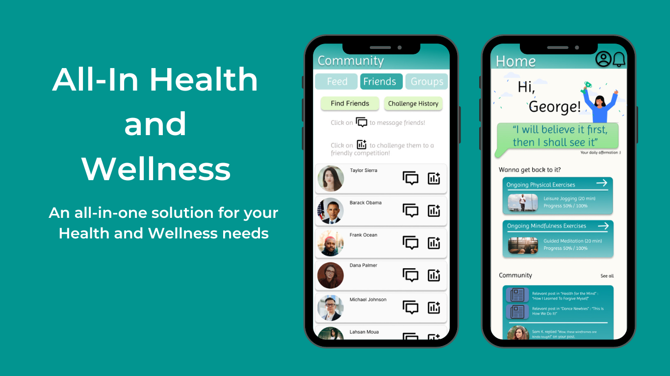
All-In Health and Wellness is an iOS app idea designed to assist and encourage users to learn how to manage and improve their physical and mental wellness through guided exercise programs, daily mood/journal entries and self care activities. Users can also monitor changes over time with the Fitness Trackers and Mood Entry Tracker, which visualizes all entries and activities.
Overview
This is a passion project!
The Process
Research & Insights
First, I conducted three remote Directed Storytelling Interviews to better understand user expectations, needs, and pain points regarding health improvement and mobile apps. My goal was to identify opportunities to create an app experience that would bring value to individuals seeking to learn and improve their health.
Based on the interviews conducted, three common themes emerged: community building, progress tracking, and a guiding tool. Each user identified these aspects as significant factors to helping them maintain positive health and wellness.
Using the insights gathered across all three participants, I finalized a User Goal Statement for the user group I intended to design for:
As I move forward with creating and designing the app features, I want to keep in mind: Users want a health and wellness app that—
Is easy to use
Provides tools and resources for starting their journey
Provides a way to track activity progress
Allows a space for connecting with others who share similar health and wellness goals
“My user group is adults between the ages of 18-30 interested in a community-oriented health and wellness app that includes features for community building, progress tracking, and guiding tools and resources from fitness experts throughout their journey.”
Information Architecture / Architectural Diagram
As I began to define the nature of the app, I identified some general tasks and the actions my User group would take to complete each task. Using this information, I was able to create Task Flows. Using the Task Flow Diagram (Architecture Diagram), I began to sketch and draw out some low-fidelity wireframes.

Low-Fidelity Wireframes / Sketches
Prototyping and Testing
Objectives
Assess overall usability of the prototype
Identify sources of confusion or frustration within the app, whether it be navigation, etc
Gauge relative interest in the app
Observe how easily users can complete/navigate to Core Tasks
Core Tasks
Home Page - Check Profile page to edit/view personal information
Physical Page - Build a new customizable Physical exercise program
Mindfulness Page - Complete a daily mood entry/check in
Community Page - Send a direct message (DM) to a friend, Find Groups to join
Discover Page - Find an Expert’s opinion on how to correctly perform Physical exercise
Quantitative Results
Home Page - Check Profile page to edit/view personal information
(1/4) of users had trouble
Physical Page - Build a new customizable Physical exercise program
(1/4) of users had trouble
Mindfulness Page - Complete a daily mood entry/check in
(0/4) of users had trouble
Community Page - Send a direct message (DM) to a friend, Find Groups to join
(1/4) of users had trouble
Discover Page - Find an Expert’s opinion on how to correctly perform Physical exercise
(2/4) of users had trouble
Conclusion
Next Steps
More usability testing and iteration
Prototype more features within the app to be usable
Expand the Progress Trackers with more in-depth options and data
Prototype the mood entry slider and other key animations within the app
Create Onboarding Screens
Strengthen Branding of the app
Key Takeaways
The app seems to be generally straightforward to use; Click on the Physical page for physical activity, Mindfulness page for Mental Health exercises, Community page for social interactions, and Discover page for finding new things to learn.
There is too much information (text) on the screen at once, causing a bit of stress (information overload).
More consistency and coherence between text and colors are needed within the app.
Branding of the overall app is needed as well.
What I Did
Directed Storytelling Interviews
Feature identification
Information architecture
Sketching & interaction design
Lo-fi prototyping & testing
Medium-fidelity prototyping (Figma)
What I Didn’t Do
Design and prototype every feature within the app
Address every issue or flaw revealed during testing
Create Onboarding Screens